Antonio Park
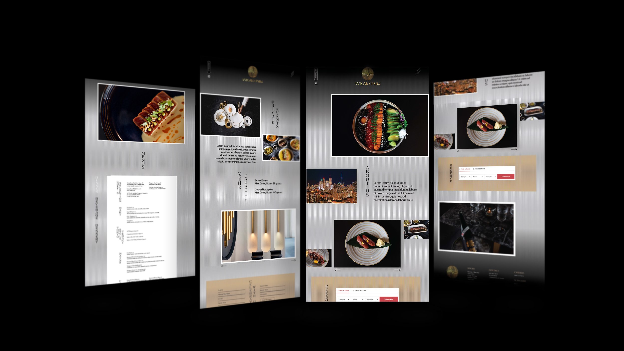
Antonio Park (AP) – Luxury Sushi Restaurant Branding
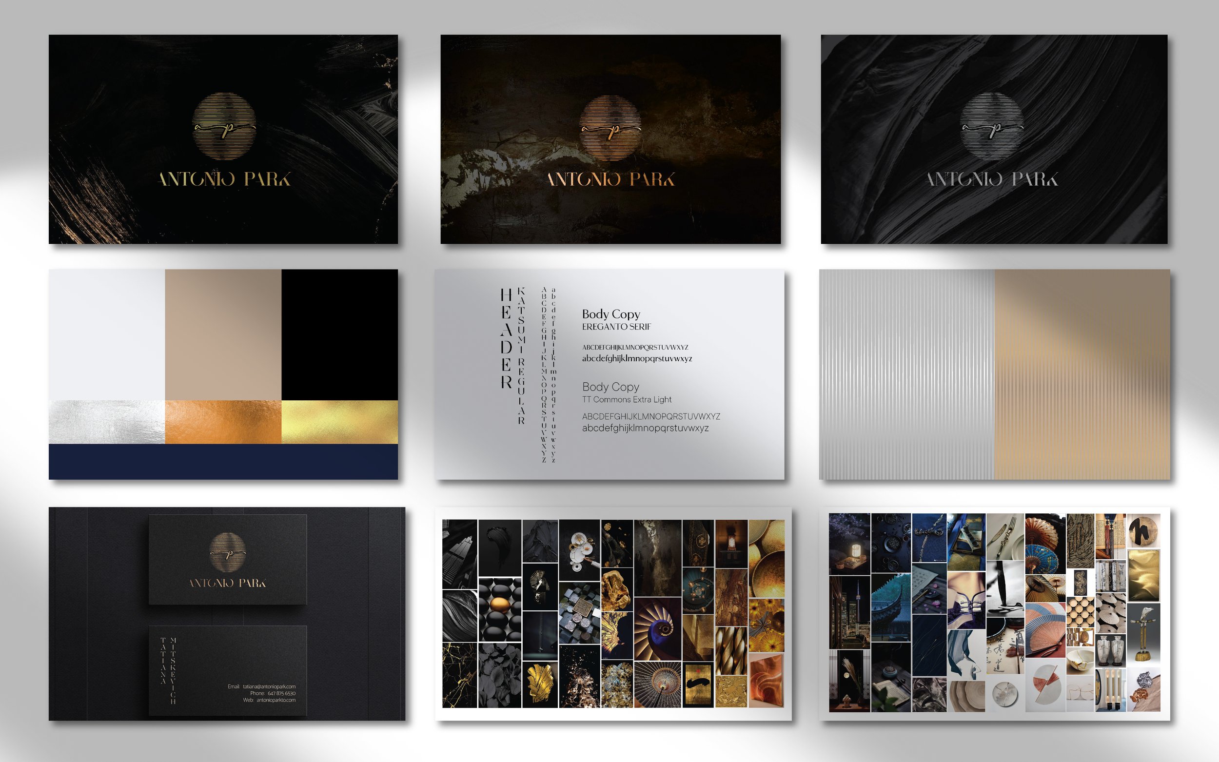
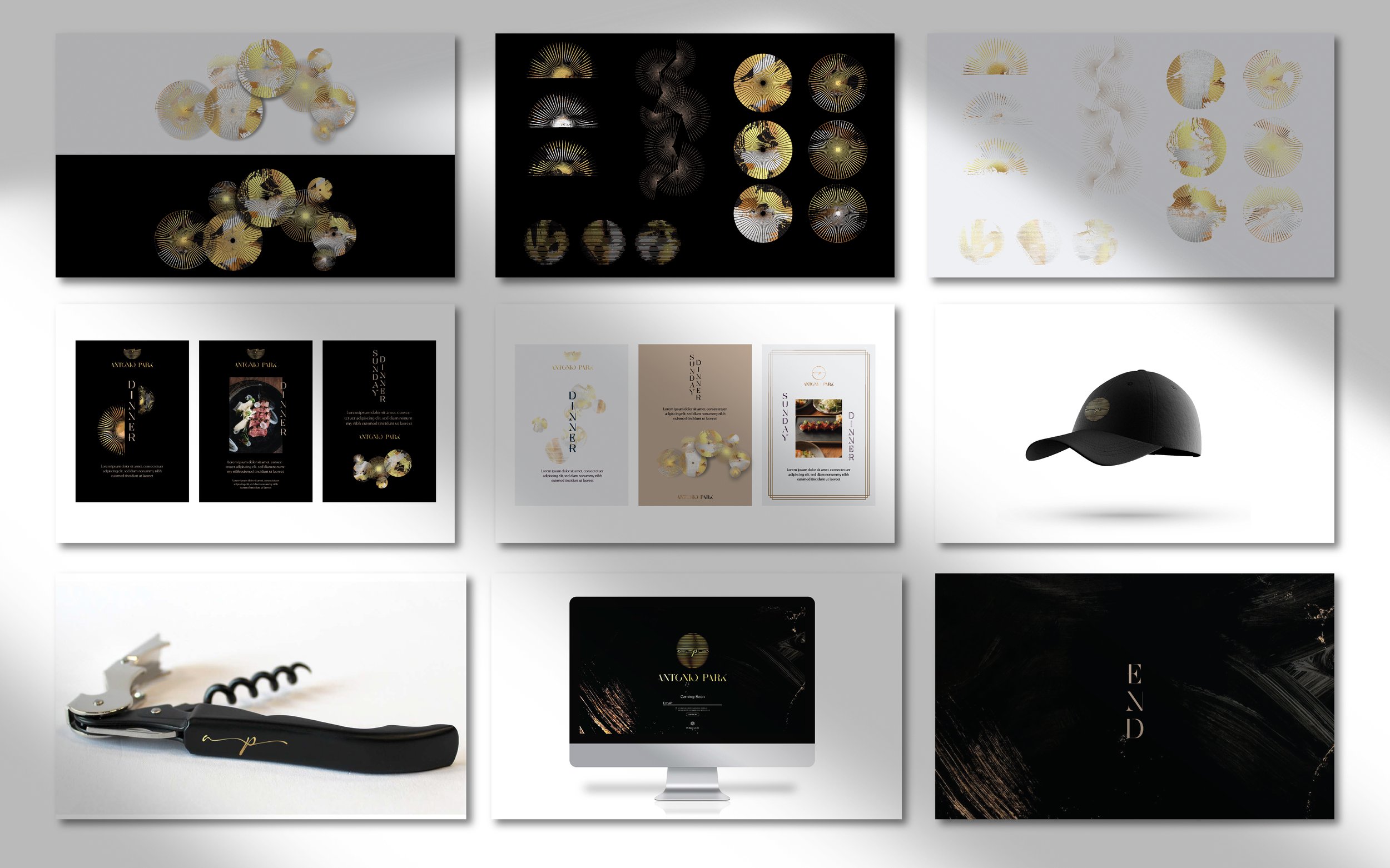
Antonio Park, known as AP, is a premier sushi restaurant that opened in Toronto in December 2022. While working at Scale Hospitality, I developed both the brand and website, shaping the identity from the ground up—starting with the logo and mood board to establish its aesthetic and ambiance.
Rooted in the sophistication of Japanese design, the brand features a refined colour palette, elegant typography, and a balance of deep black tones with metallic textures to evoke luxury. Graphic elements take inspiration from traditional Japanese umbrellas, adding a distinctive visual signature. The website extends this vision, creating a seamless and immersive digital experience that reflects the brand’s elegance.
The Icons Series
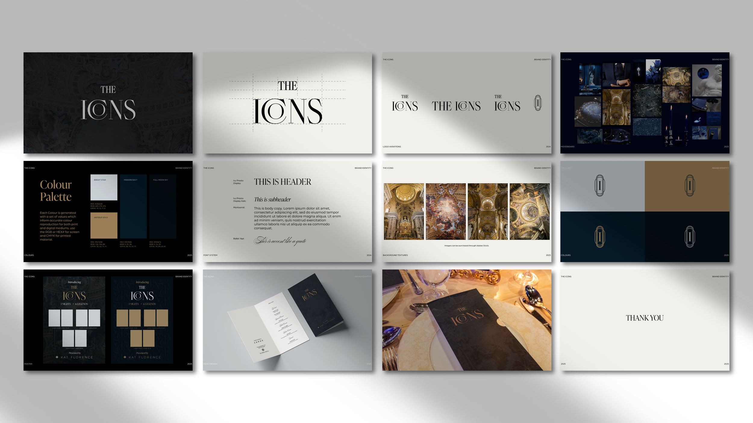
The Icons – Brand & Website Design
I developed the visual identity and digital presence for this high-profile event series, where acclaimed chefs and celebrated Canadian musicians came together for a one-of-a-kind experience.
The brand needed to reflect the elevated tone of the events—refined, intimate, and rooted in the world of fine dining. I created a sophisticated visual language that balanced elegance with a contemporary edge, ensuring a cohesive look across print and digital platforms.
Using Adobe InDesign, Illustrator, and XD, I designed everything from the logo and typography system to the full website layout, creating a seamless and polished experience that matched the atmosphere of the series.

Sfera Caviar
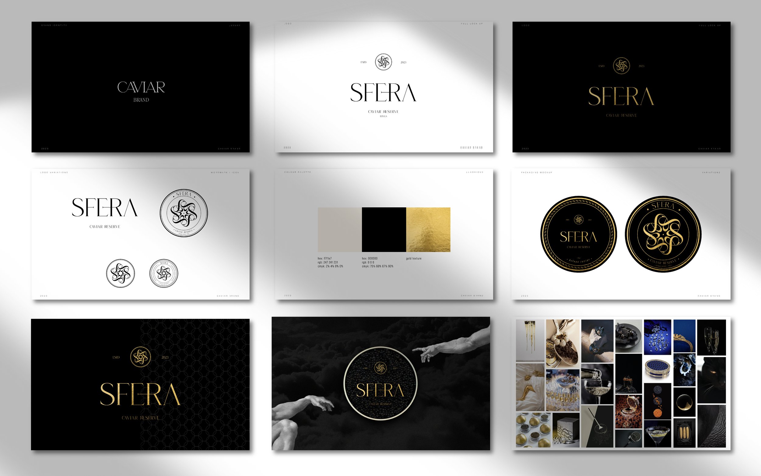
Sfera Caviar – Brand Identity Design
Sfera Caviar is a luxury brand I developed as a freelance project, with a focus on creating a refined and elevated visual identity. I designed the logo and its variations to reflect the exclusivity of the product, using a palette of rich black and gold to convey sophistication and timeless elegance.
In addition to the core identity, I designed a series of brand pages that visually communicate the premium nature of the offering—balancing minimal design with bold, high-impact details to underscore the product's exclusivity.
Block Plan Studios
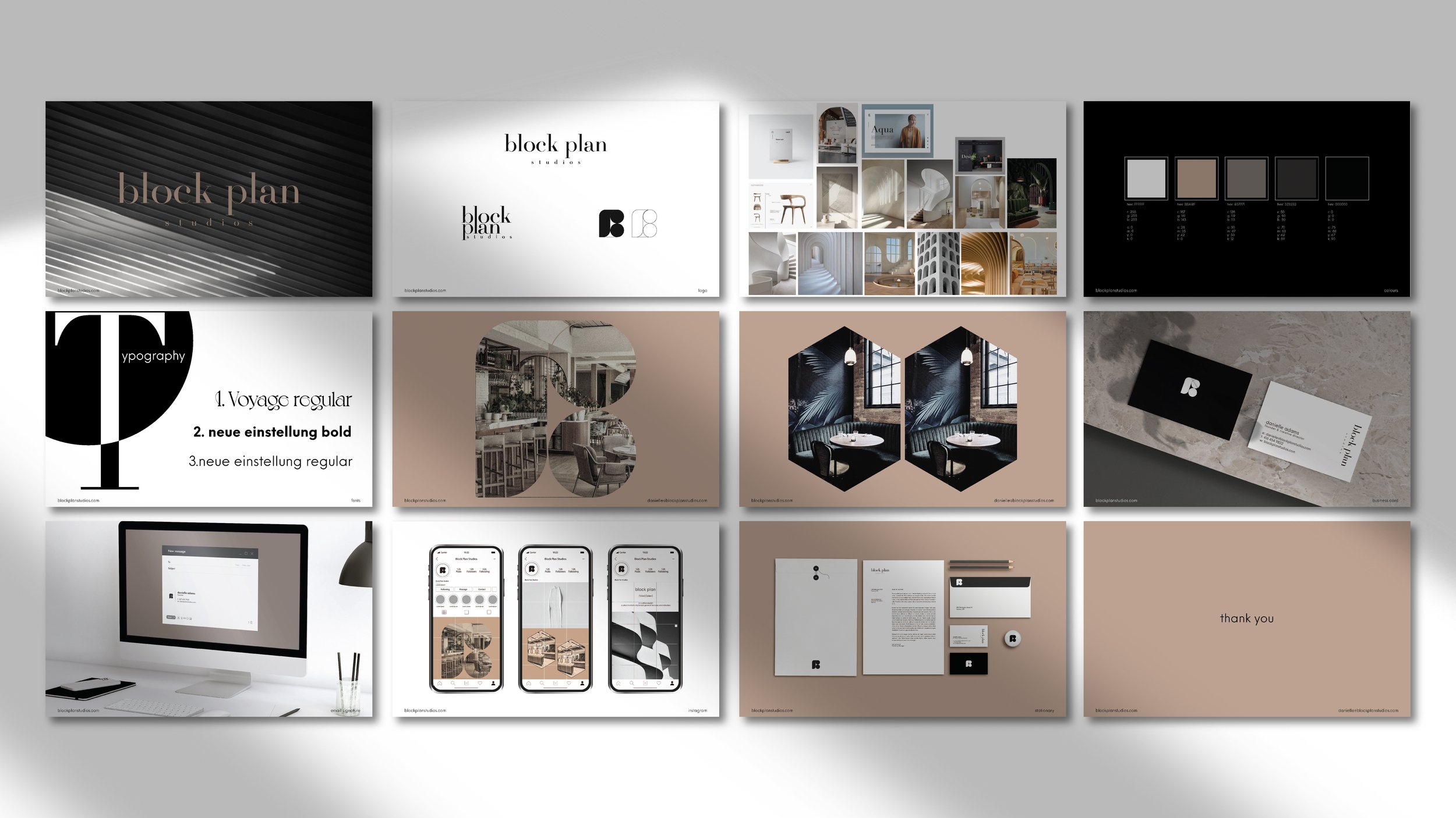
Block Plan Studios – Brand & Website Design
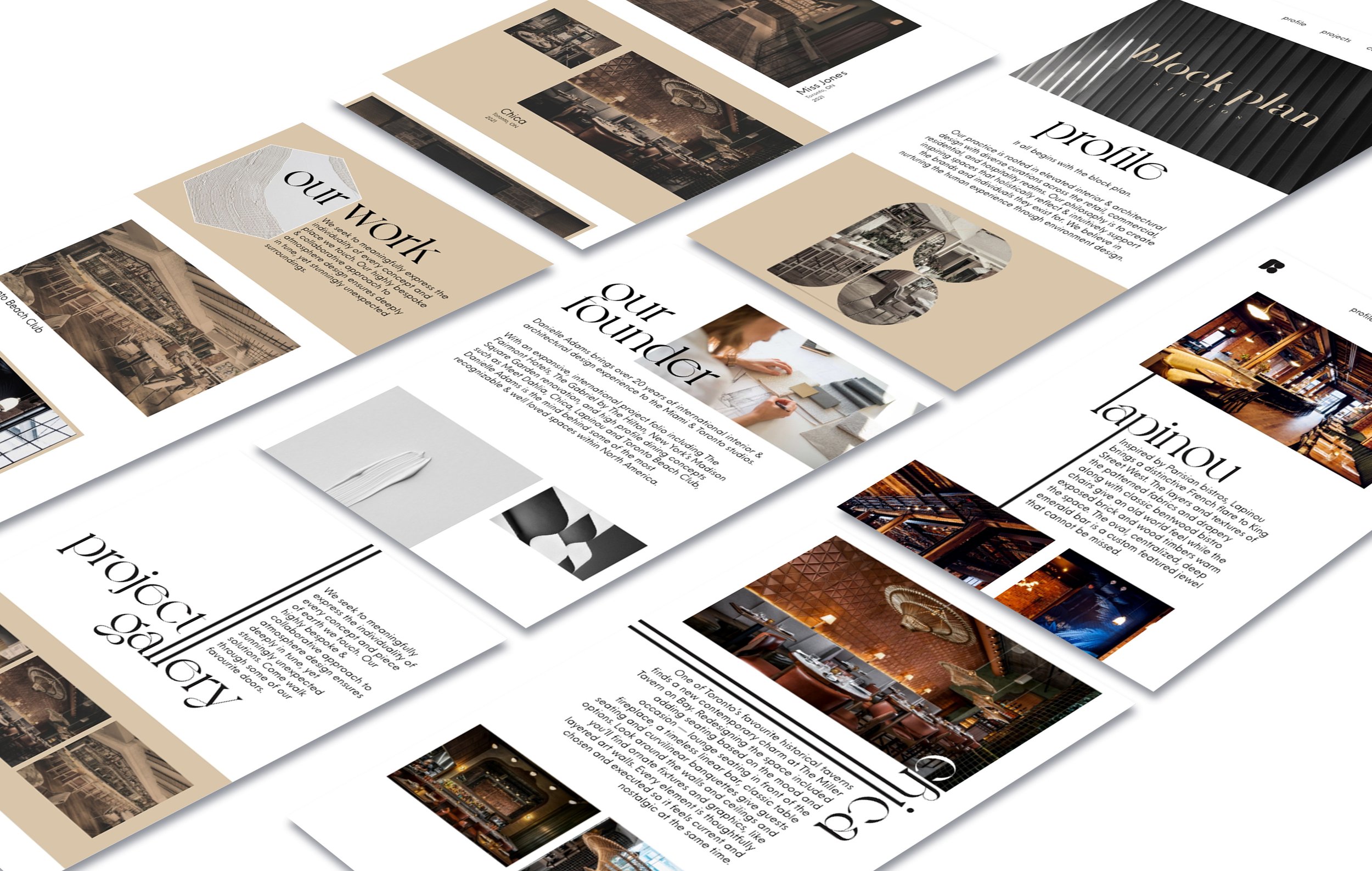
Block Plan Studios is an interior design company focused on clean, minimal aesthetics. While working on their brand, I developed a refined identity with an androgynous style, ensuring the design remained understated to keep the spotlight on their work rather than graphic elements.
The brand’s palette is primarily black and white, complemented by neutral tones like beige and grey to maintain a sophisticated and timeless feel. I also designed the website, which was the most time-intensive aspect of the project, as it would become their primary platform for showcasing their portfolio and attracting clients.
Miss Likklemore’s
Miss Likklemore’s - Brand & Website Design
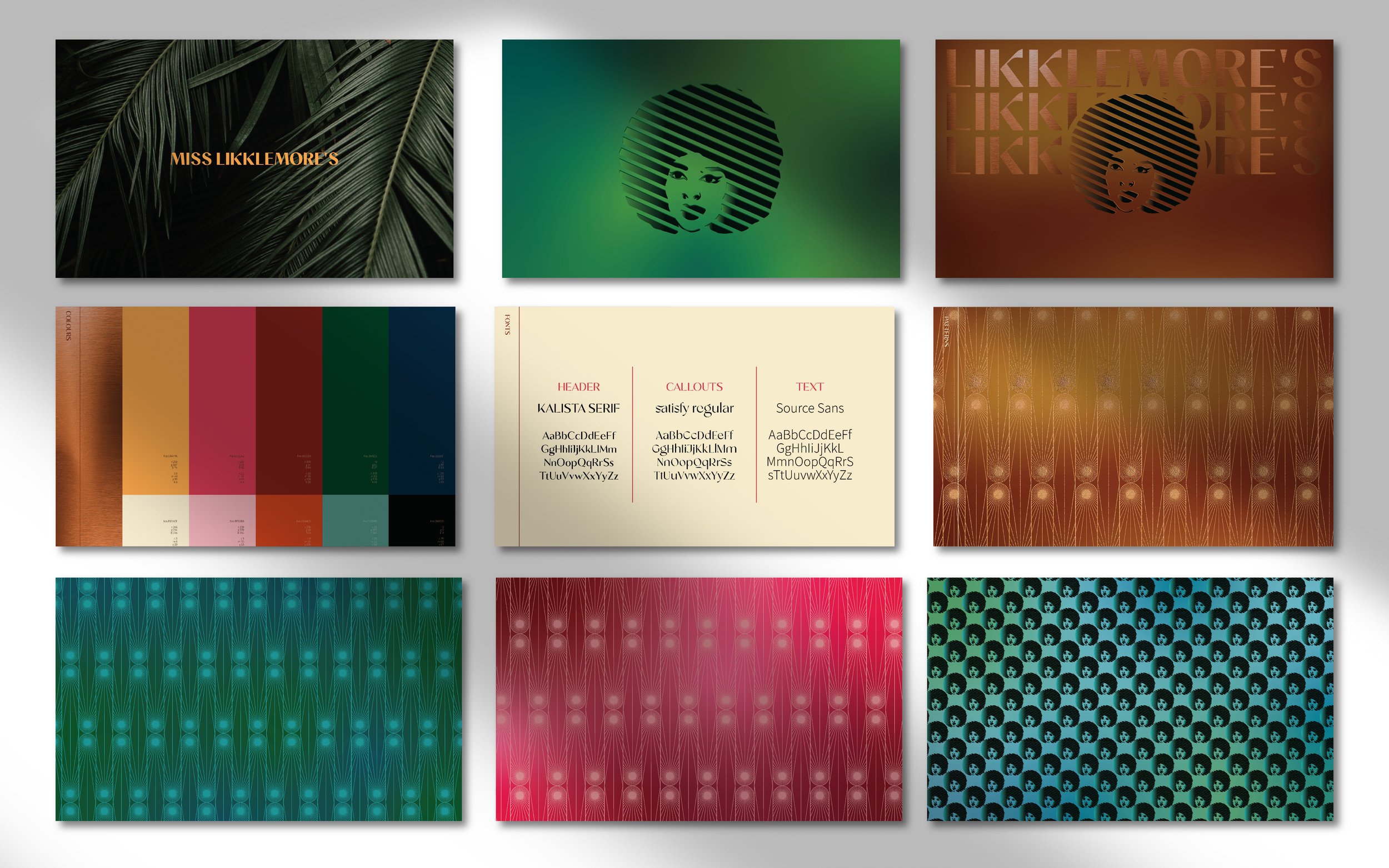
This is the latest brand I developed, created for Miss Likklemore’s — a Caribbean-inspired restaurant that opened in August 2022 in the heart of Downtown Toronto, under Scale Hospitality.
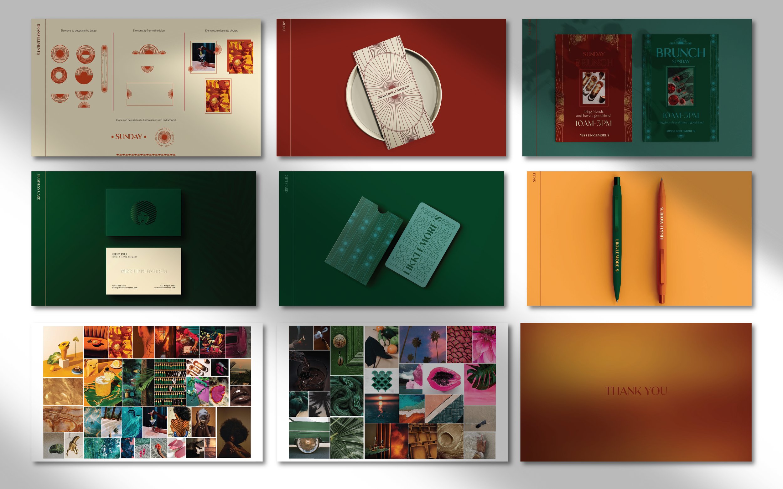
Inspired by the vibrant beauty of peacock feathers, I designed a signature pattern that, combined with a radiant color palette and copper foil accents, brought the brand to life. Once the pattern was established, it became a versatile design element that I repurposed throughout the brand system to create a wide range of graphic assets.
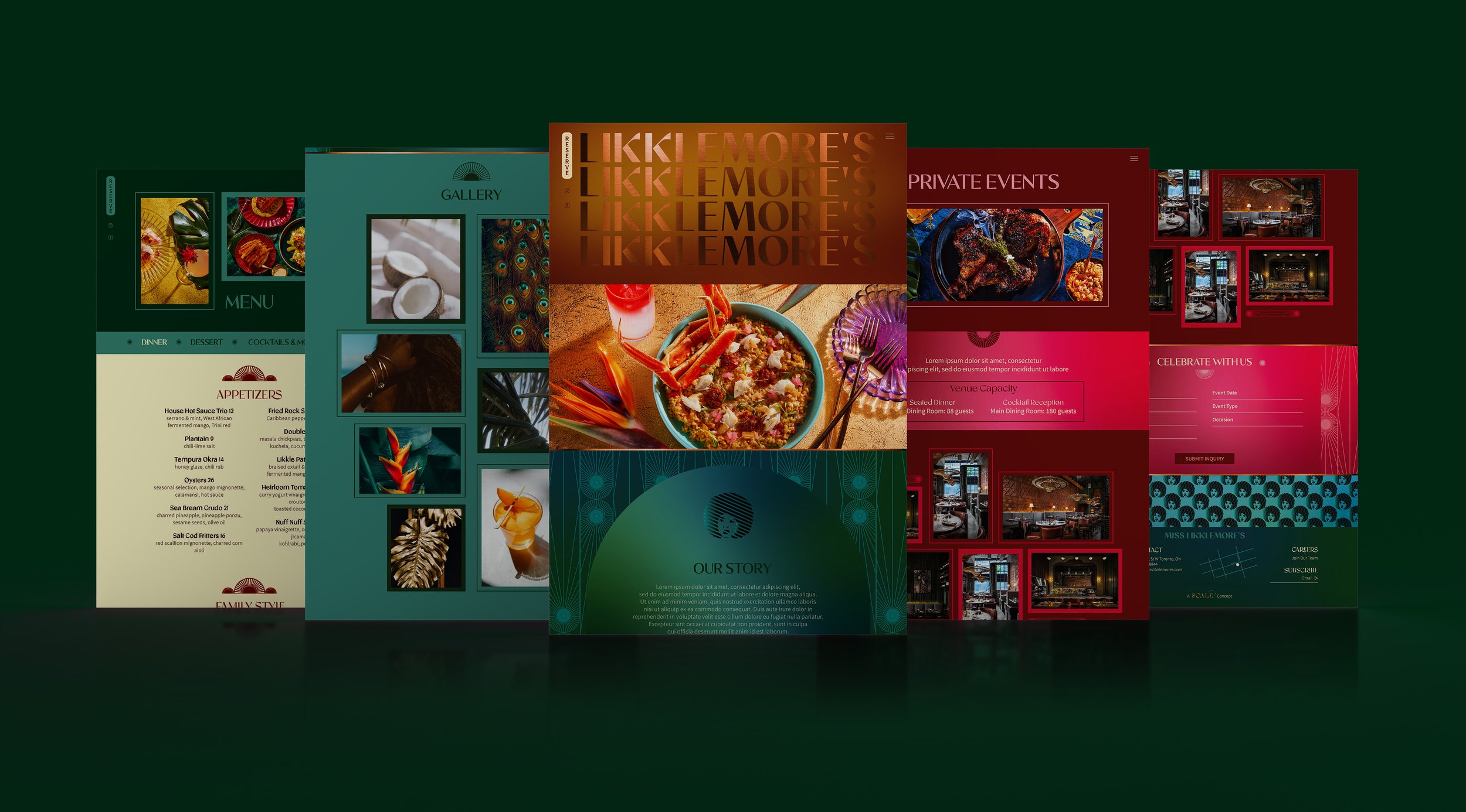
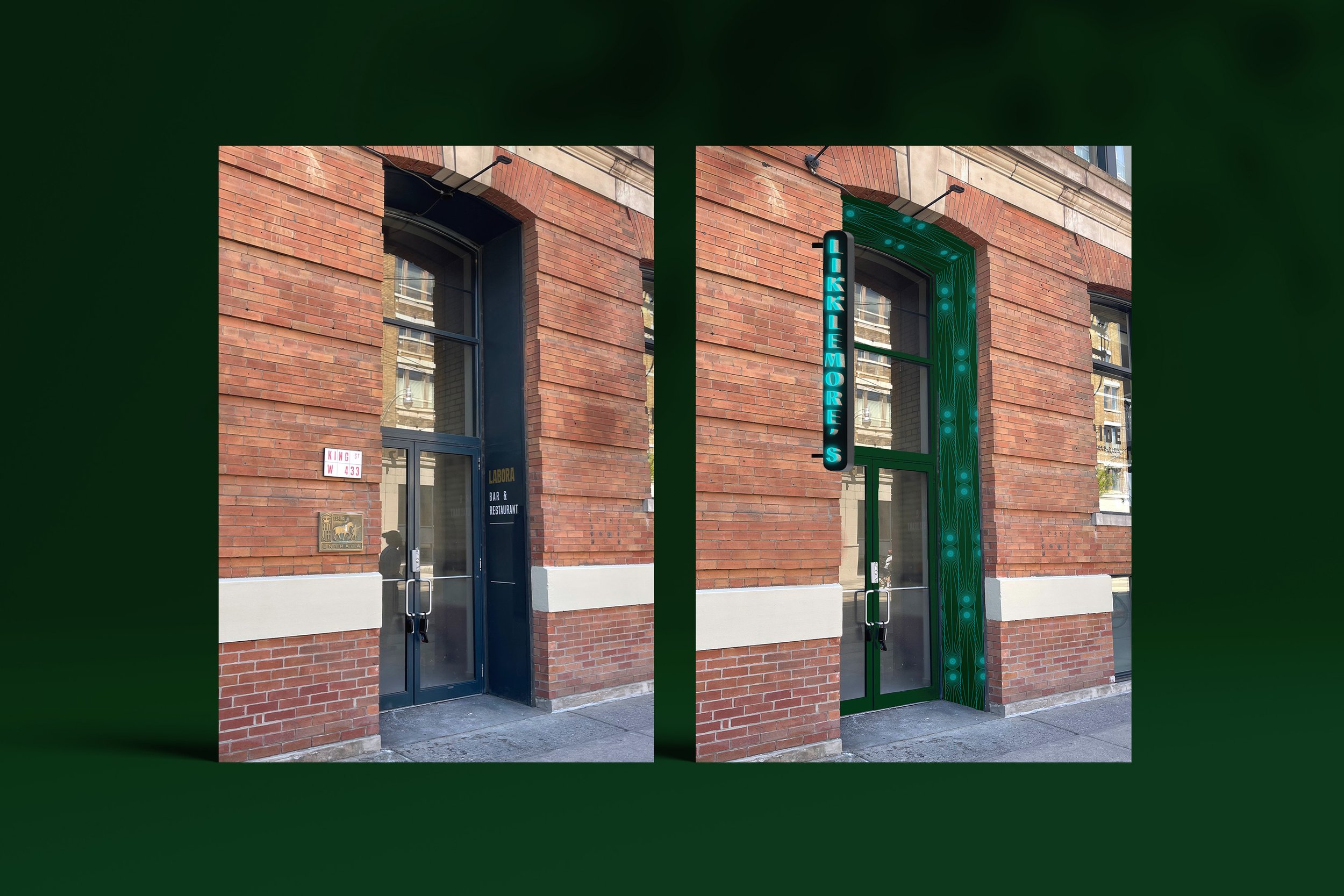
I developed the brand using Adobe Illustrator and InDesign, and later designed the website in Adobe XD to ensure the brand was represented consistently and thoughtfully online. The final stage of the project was signage design — I created mockups and applied the pattern to frame the entrance and signage for a cohesive, standout look. You can see before-and-after visuals of the mockups in the presentation below.
Tony’s Sourdough Pizzeria
Tony’s Sourdough Pizzeria - Brand & Web Design
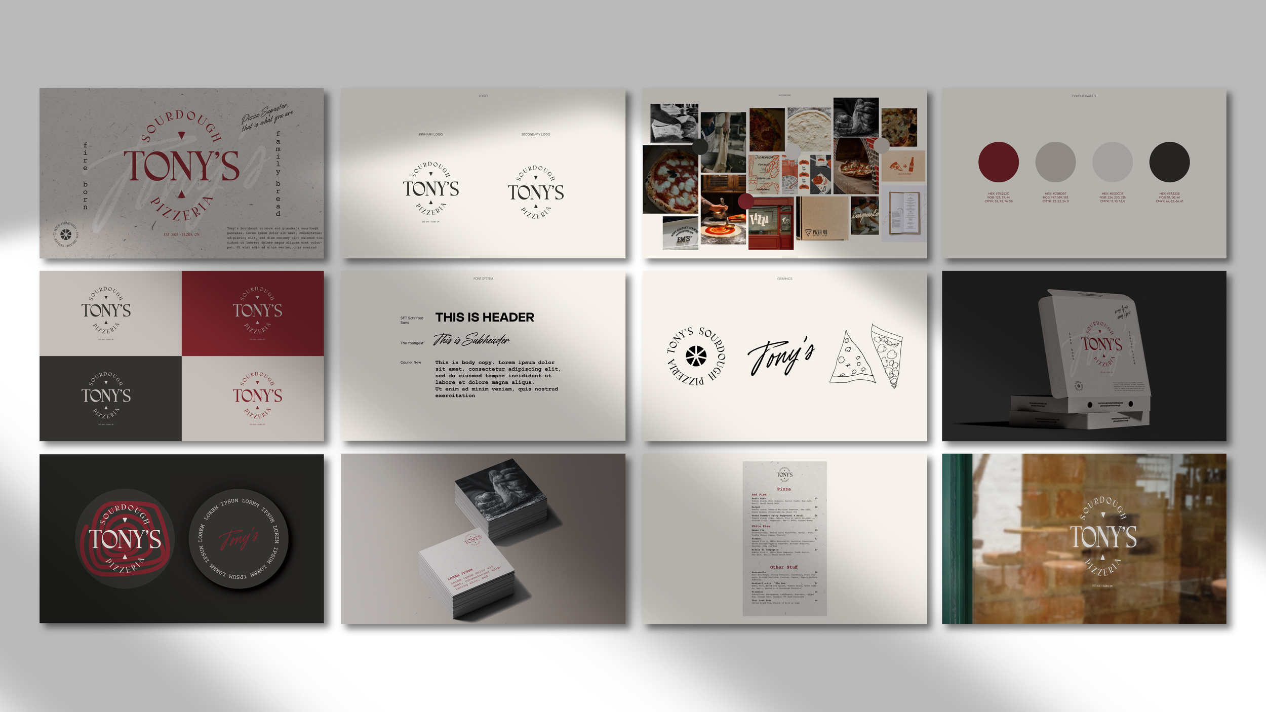
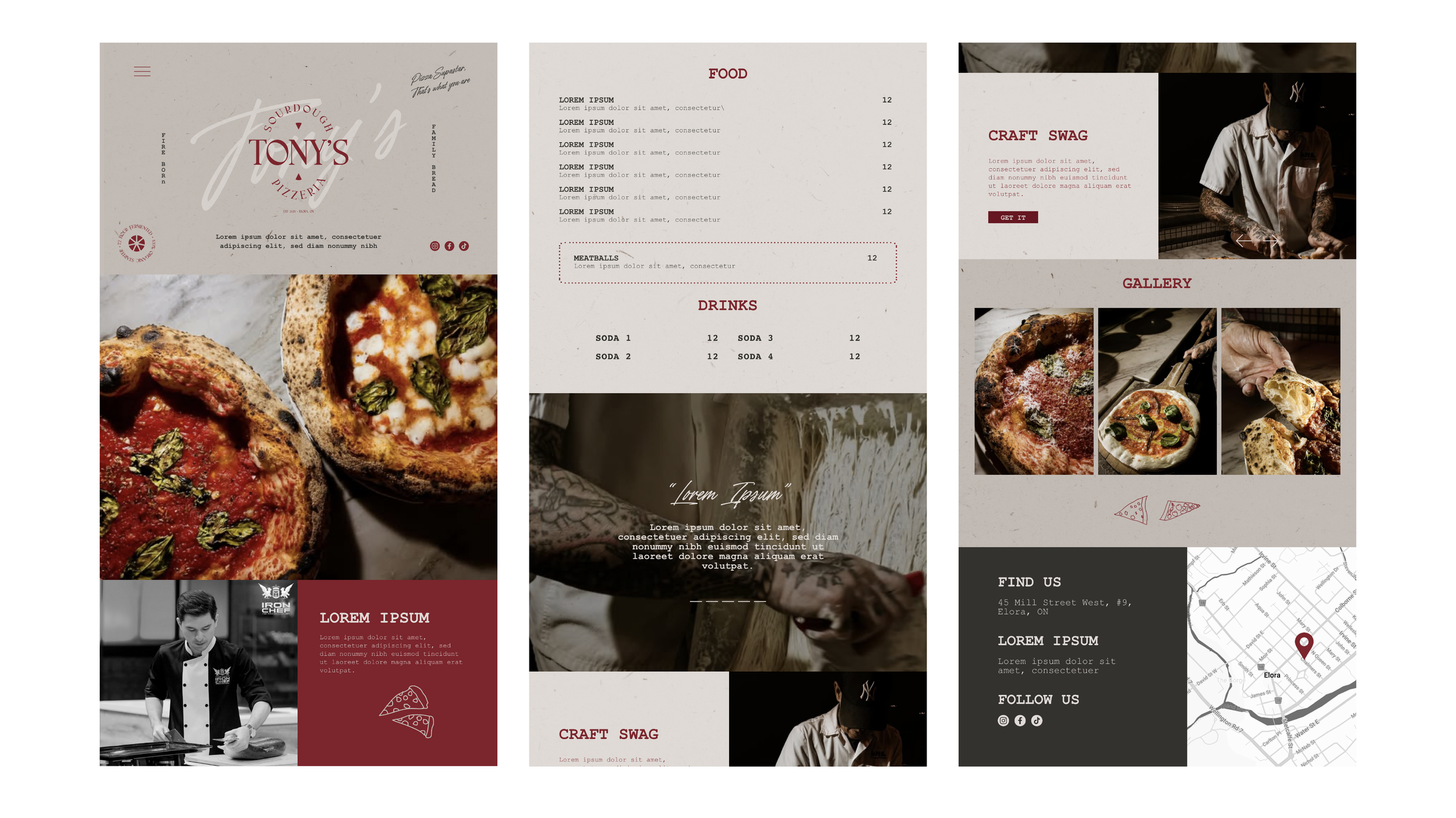
Rooted in heritage and hospitality, Tony’s Sourdough Pizzeria brings generations of sourdough tradition to life with a modern twist. My role was to capture the warmth of a family legacy and the charisma of its founder — a chef celebrated on The Next Iron Chef and Master Chef — through brand identity and web design. The result is a visual experience that feels handcrafted, inviting, and full of character, much like the pies themselves.
Design Exchange Building
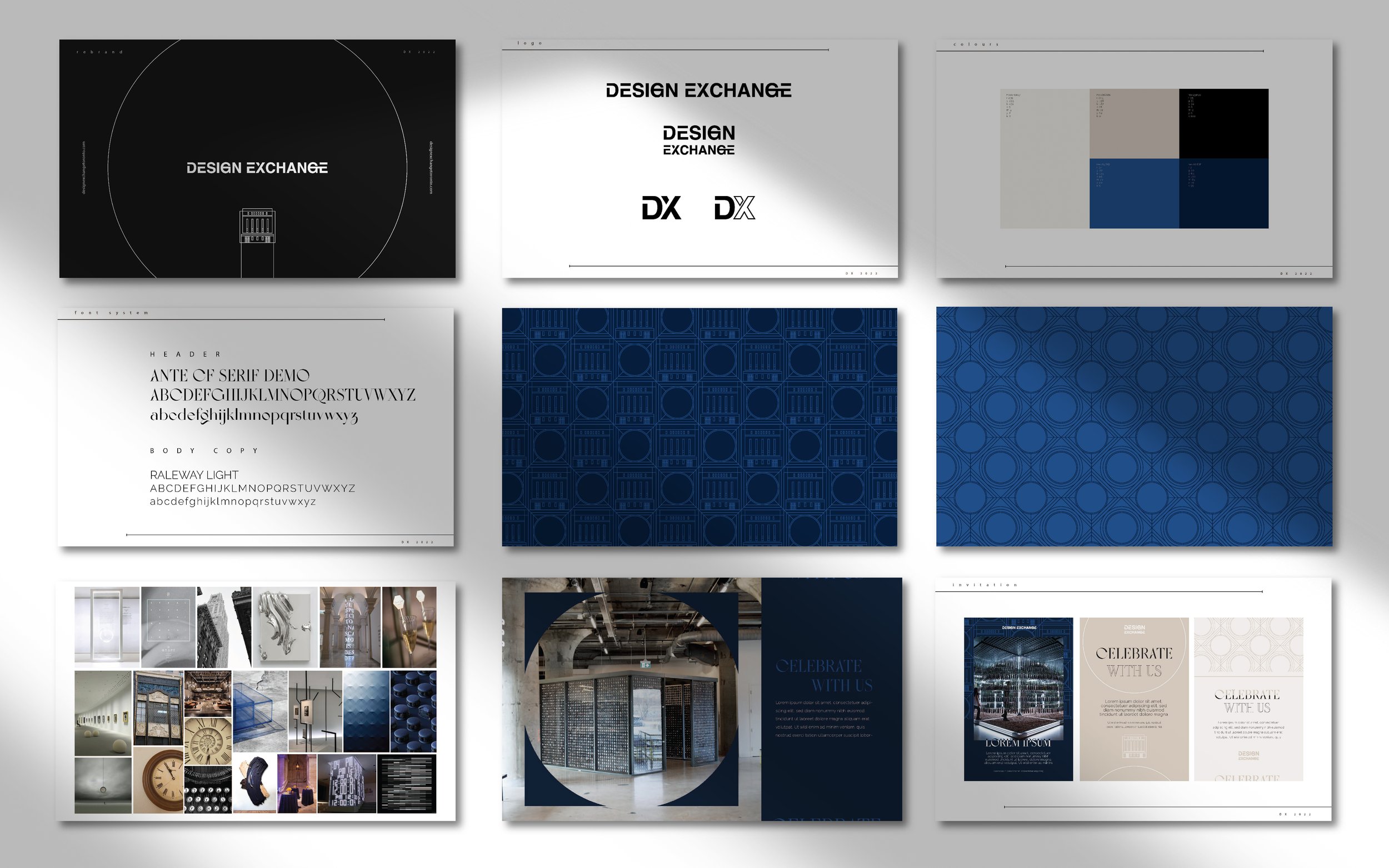
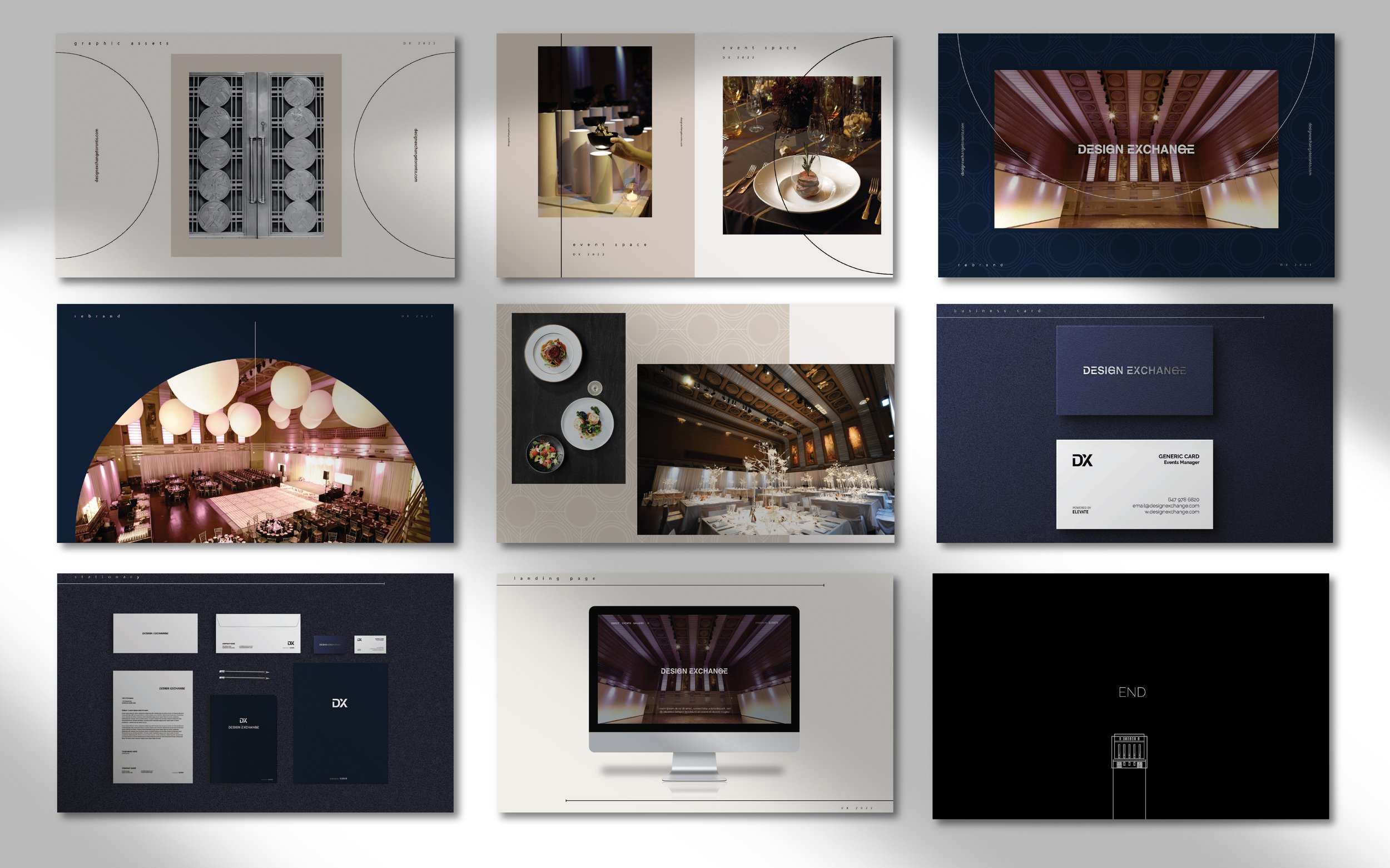
I worked on the rebrand of the historical building located in the financial district in Downtown Toronto, the old Toronto stock exchange building which is currently being used as an event space. I created the the logo and the rest of the brand assets to give the space a newer fresher visual form that represents the historical value as well as the innovate events being held there presently. The pattern was inspired by the ceiling ornaments in the main space, and the look and feel created to market the space in an innovative way.
Scale Hospitality
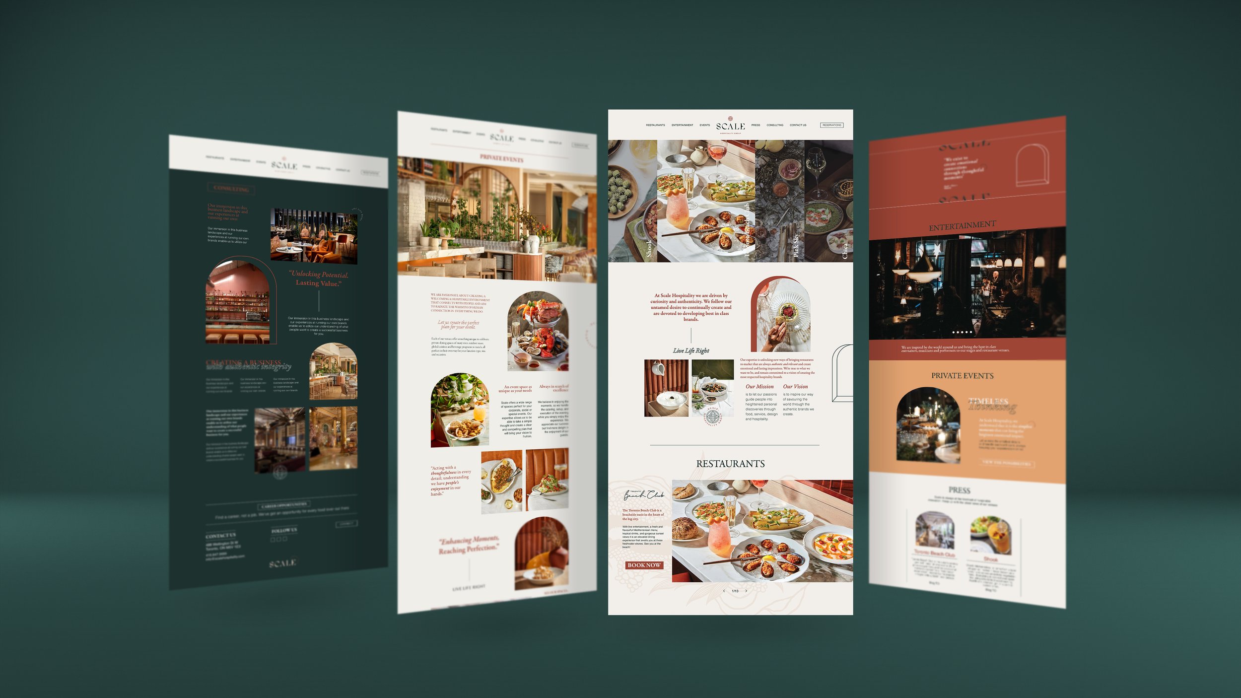
Scale Hospitality – Corporate Deck & Web Design
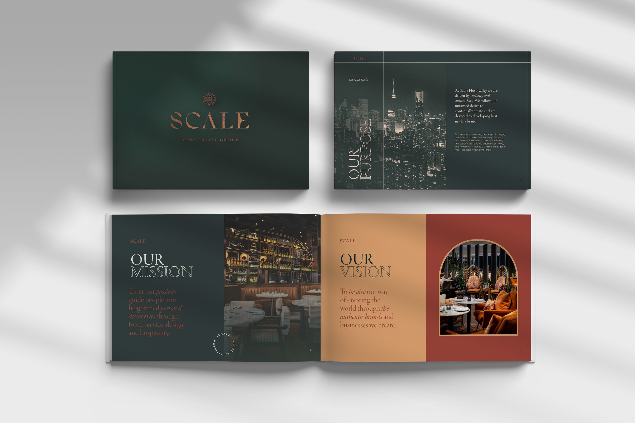
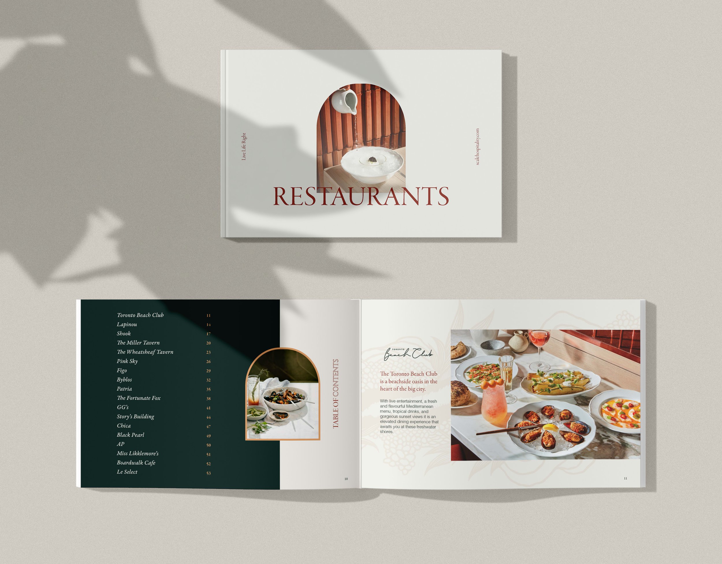
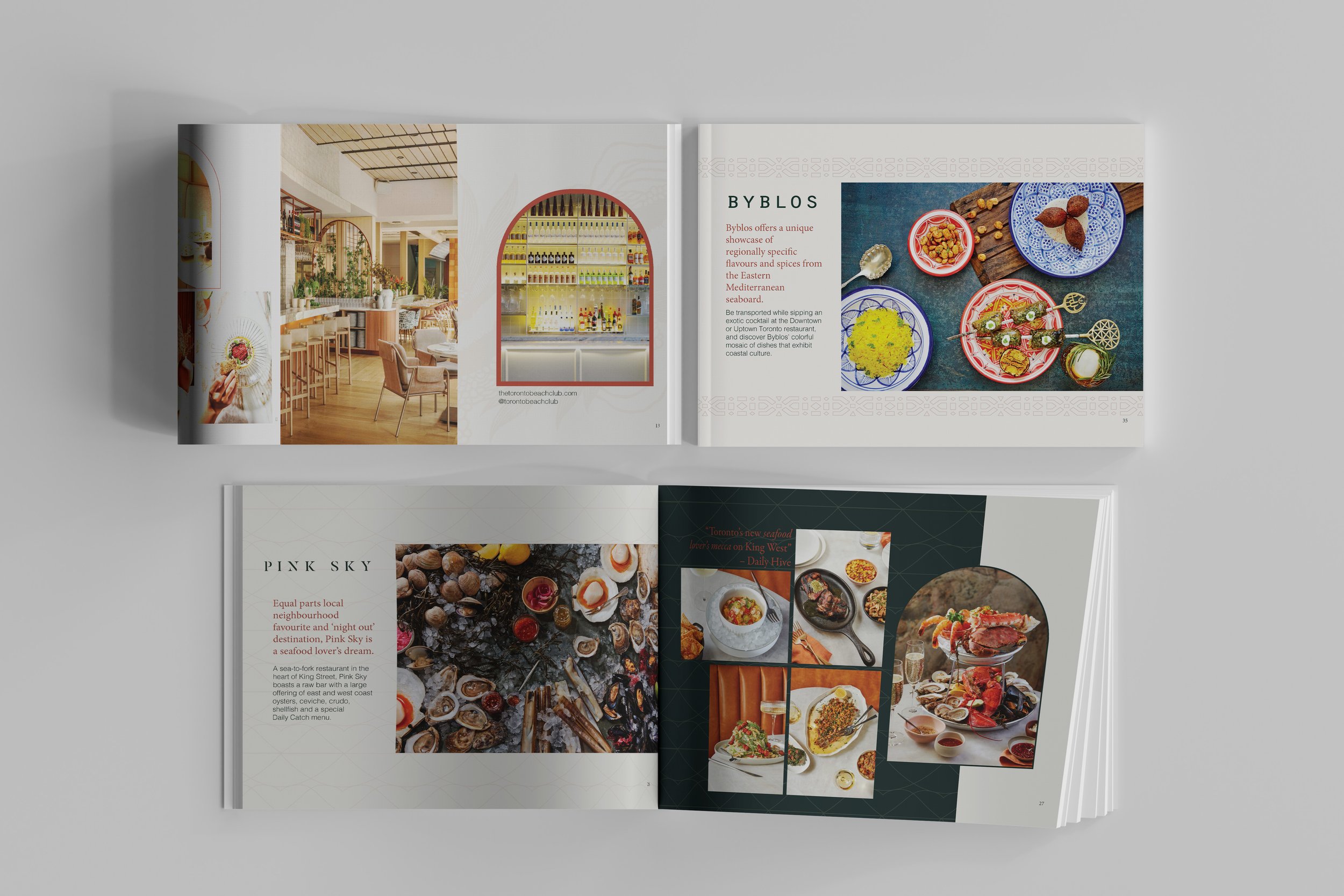
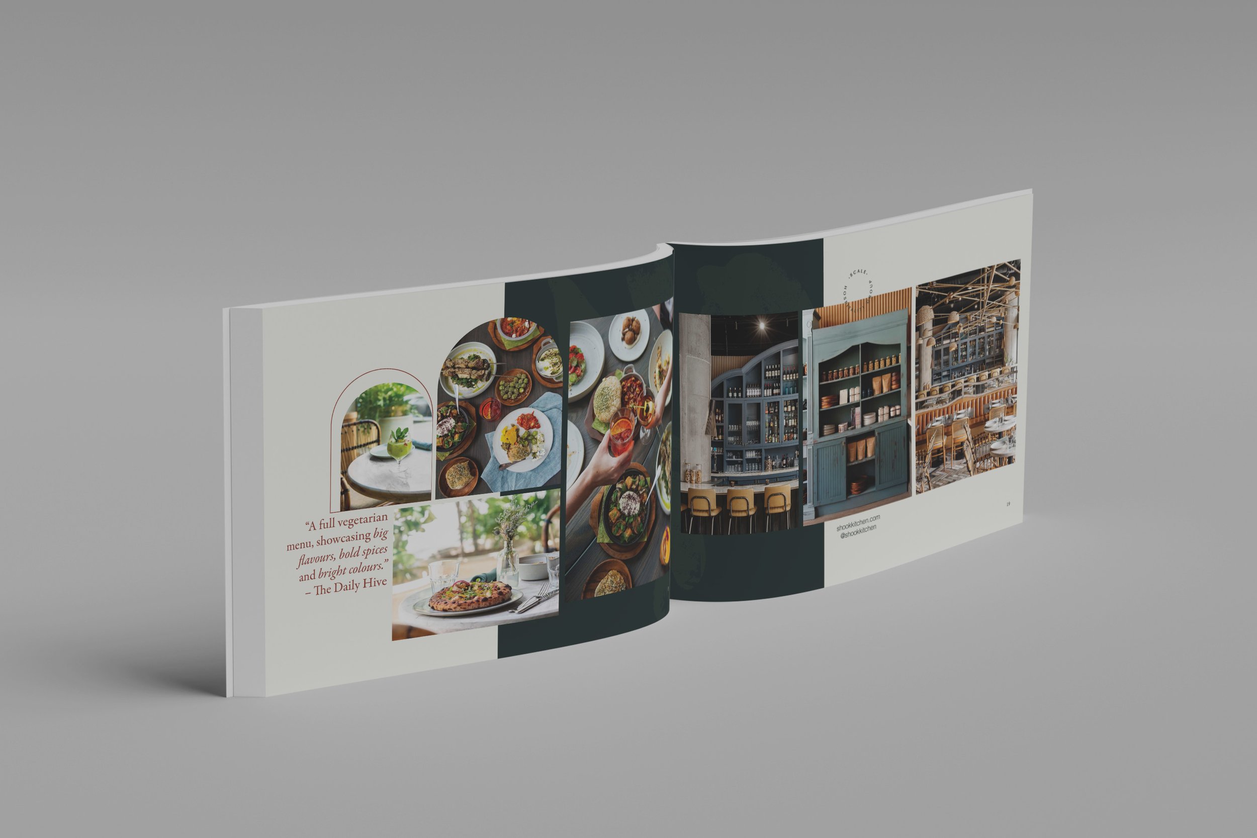
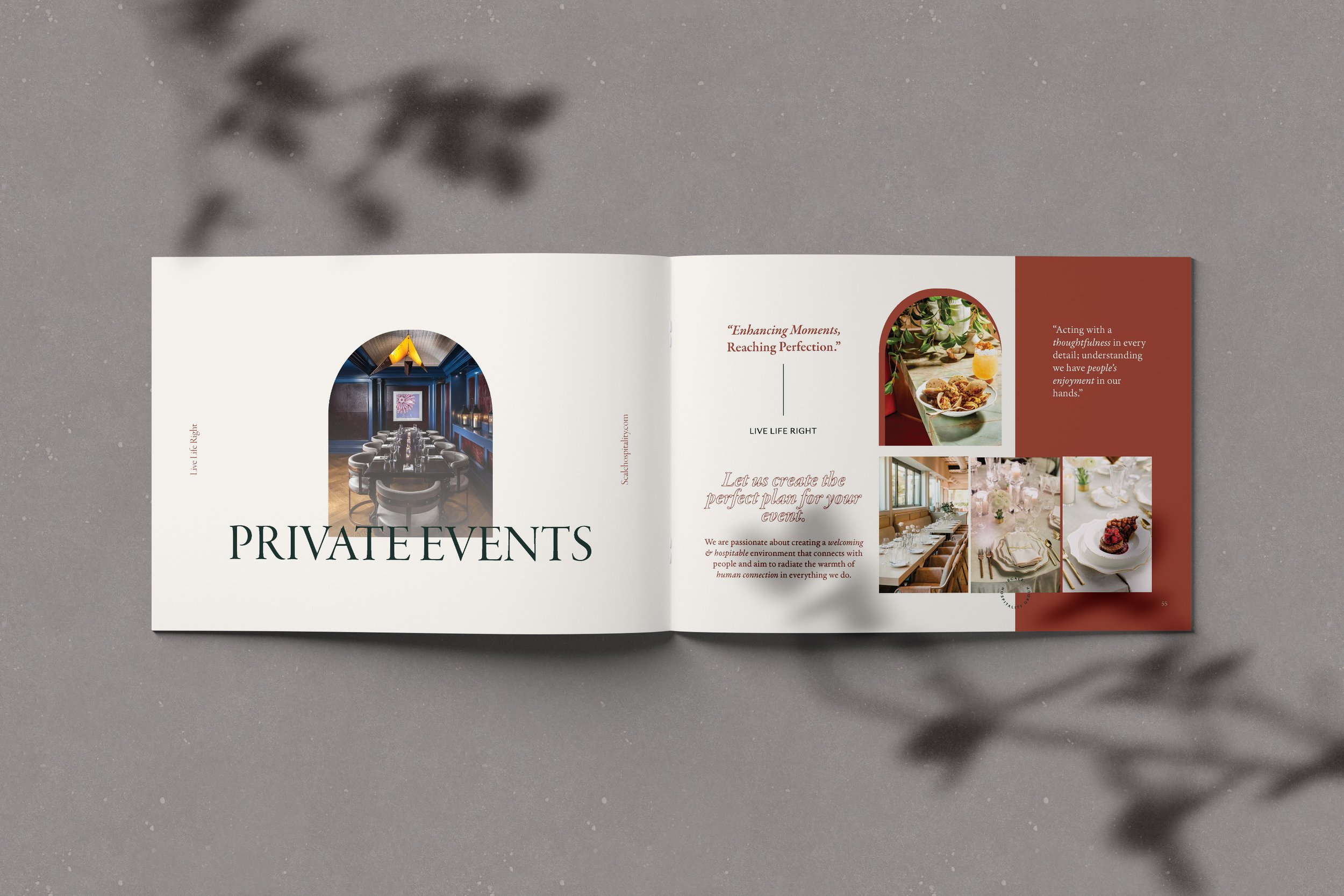
I designed the Corporate Deck and brand book for Scale Hospitality, with a focus on aligning the visual language with the brand’s elevated identity. The deck reflects the clean, sophisticated aesthetic of the website, ensuring a cohesive experience while spotlighting Scale’s diverse portfolio of restaurants.
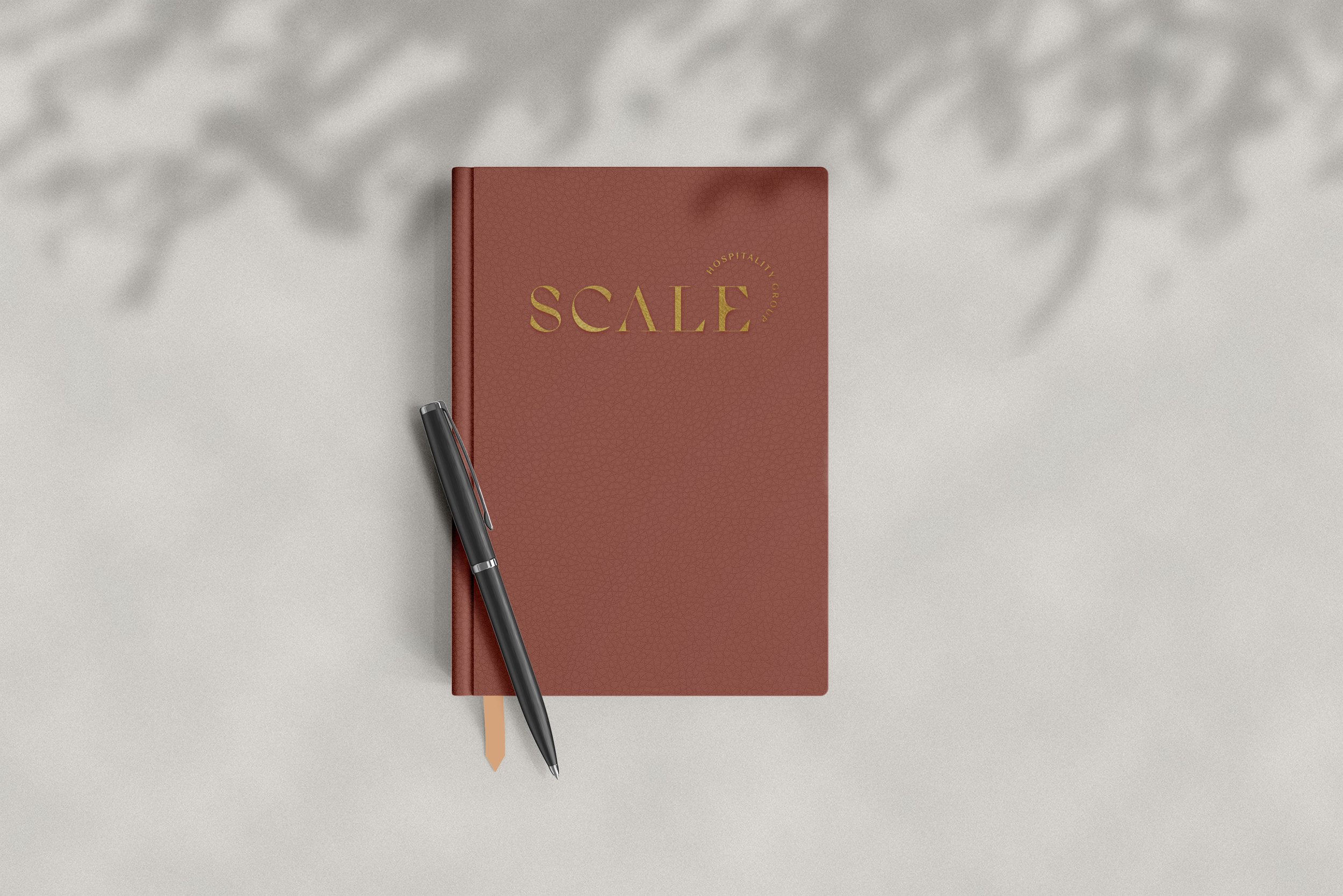
The brand book was created as a luxurious yet minimal piece, featuring a sleek leather cover with the logo elegantly embossed in gold foil. Every detail was thoughtfully considered to capture the refined tone and high-end appeal of Scale Hospitality.
Magazine layout design
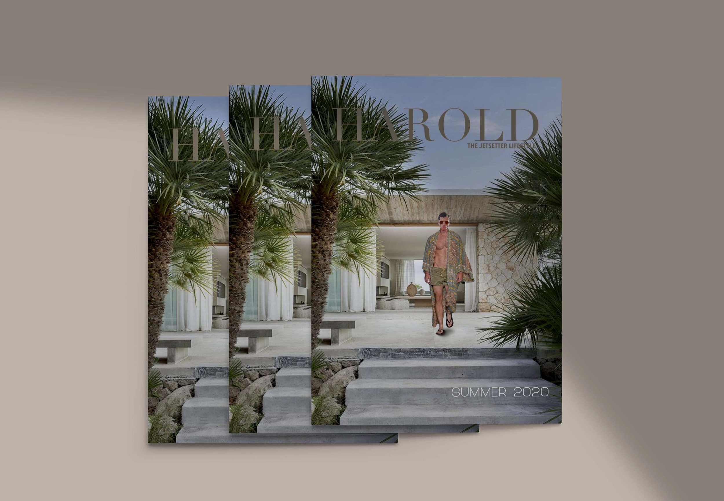
This is the cover of HAROLD magazine, which is a project I have been working on for Lulu Unlimited. I worked on this cover using Adobe Photoshop.
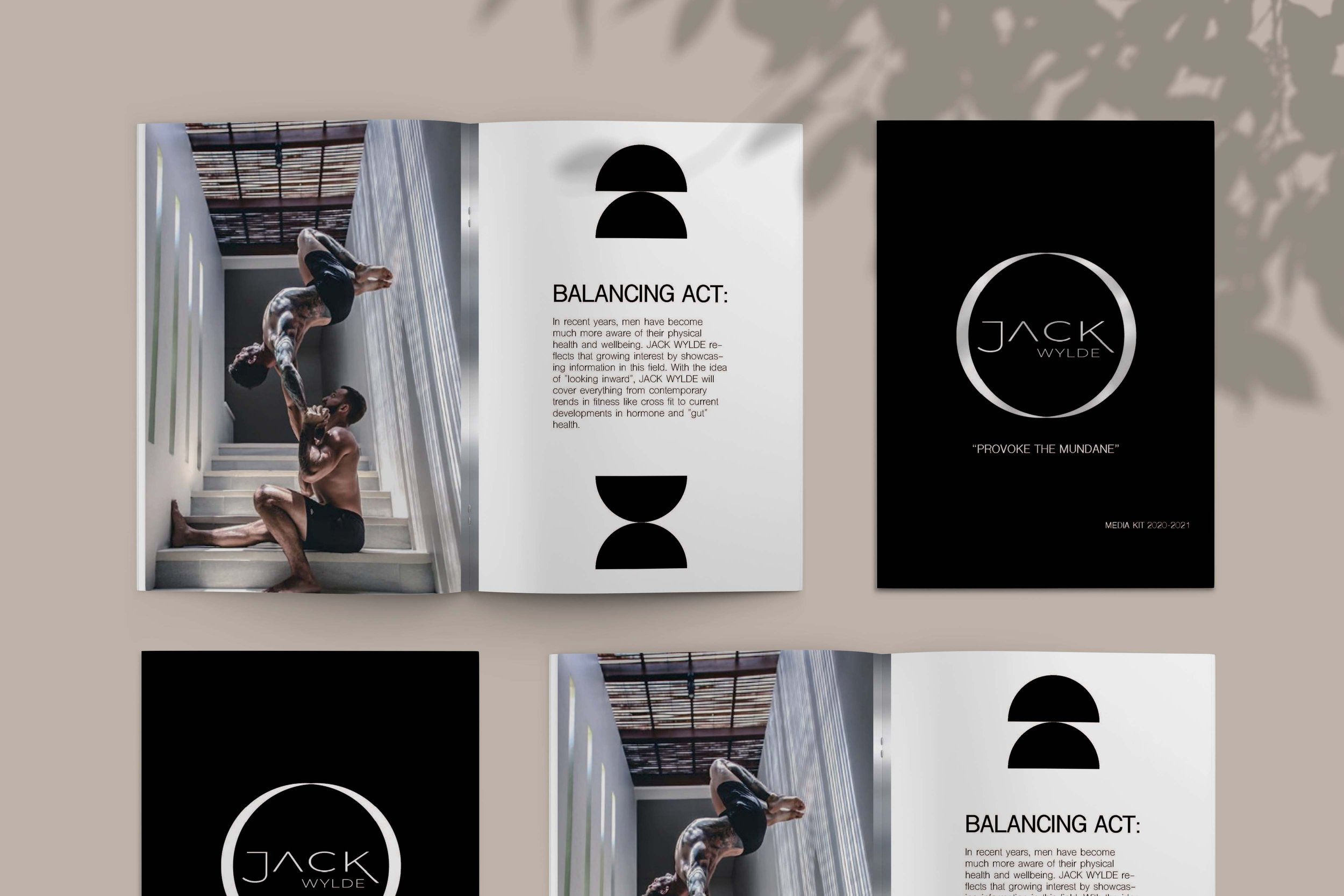
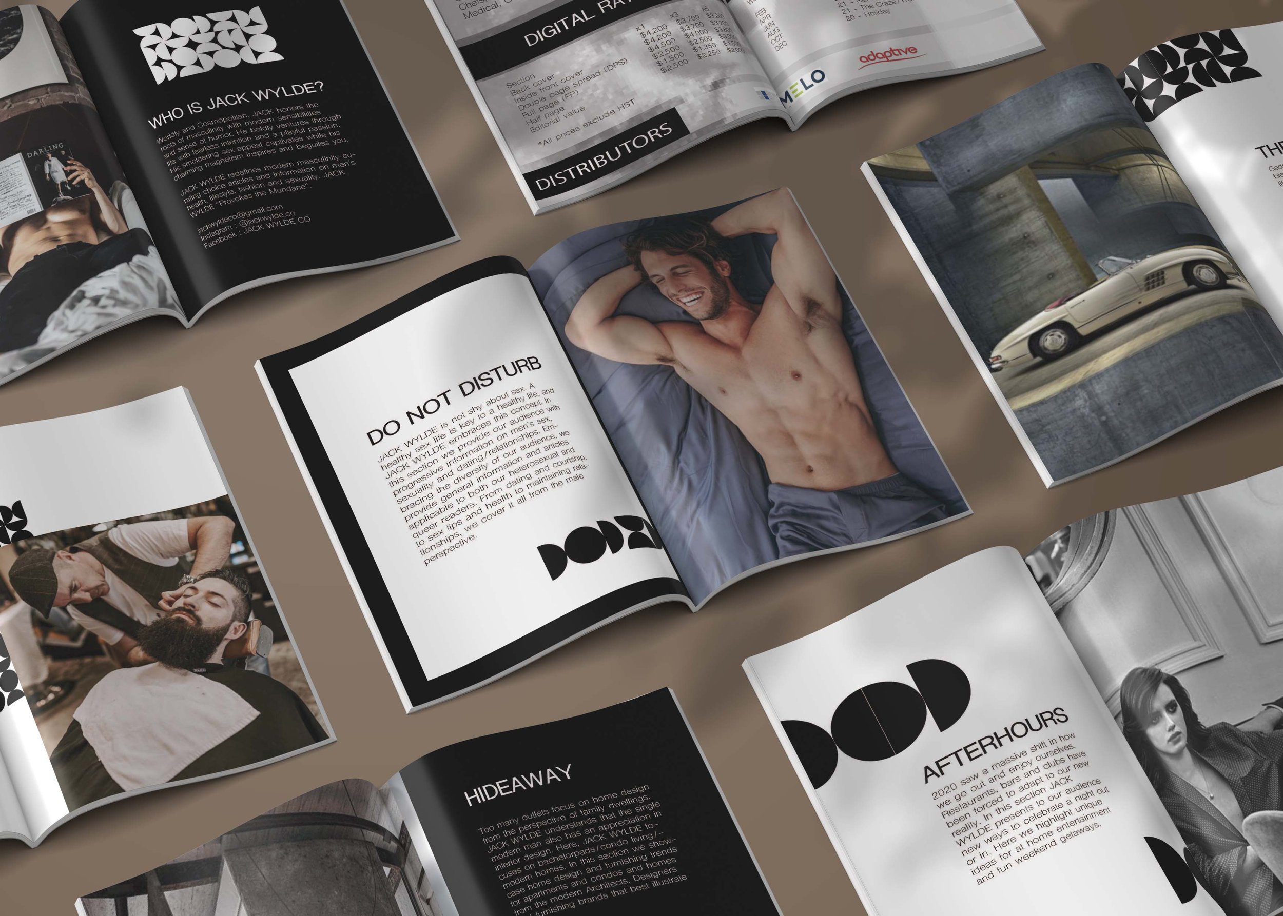
This magazine I worked on is Jack Wylde, a sophisticated and modern man's magazine. I designed this media kit for the first issue of the magazine in In Design and I enjoyed playing around with shapes, pictures and texts. The brand design is in black and white which I think emphasizes the masculinity of the overall design.
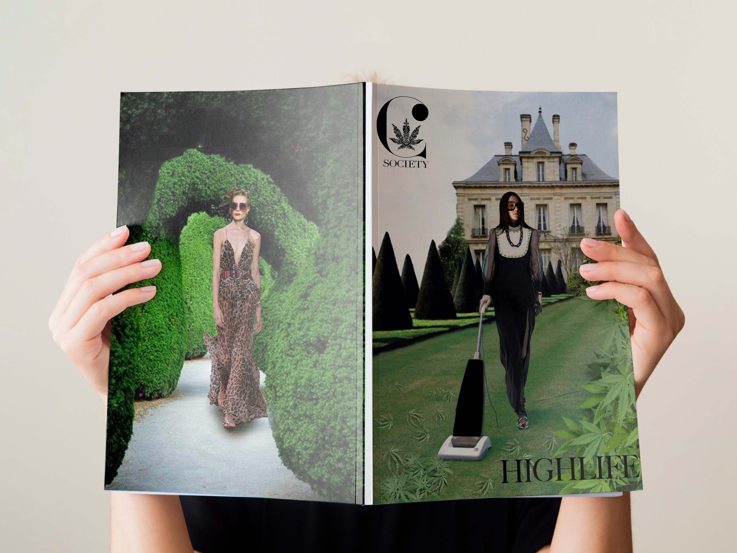
This, on the other hand is the cover and back cover of C Society, which I have worked on for Lulu Unlimited as well. Also, I have worked on a logo and bottle label for the TGS perfume The Society. I created the logo in adobe Illustrator and then went from there to create the bottle layout. And the last one is a photo which I changed in Photoshop by replacing normal leaves with marijuana leaves.
